|
Added some kitties for the final touches (along with some edits). This is in response to the artist greeting where I mentioned that I had many cats in Rumahku (my home). This guy is 'Cemplon'. Cemplon is a name of a kind of food - rice flour dough wrapped around melted gula melaka(brown sugar) and covered with coconut shavings. When I found him in the dark of the night, probably thrown away into the forest nearby from a passing motorbike, he was crying so loudly looking for his mama. It also rained heavily, so the paths he threaded on in the forest made him soaking wet. His tummy was also bloated, and therefore 'Cemplon' as it seemed like the delicacy that if squeezed, would explode with sweetness - haha!
I'm currently feeling that the background tiles in flat colours for some of the illustrations are turning out a little dull and trying out some complementary wallpapers to jazz things up. Extracted and edited the flowers from the original teh botol paper packaging for tea leaves and created a wallpaper for the 'botol' (bottle) illustration.
Addition of a wallpaper for the other illustrations that have a wall as a backdrop would also add dimension to the work. And so, customised wallpapers coming real soon... I've decided on a vertical presentation! 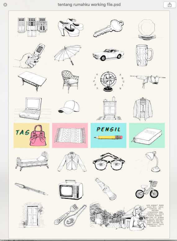 Did some toggling around with the placement of all the scans of the illustrations and I'm settling with this arrangement. I've also confirmed the background colours of what would make up the grid- going with some pastels in the shade of yellow, pink , blue and green. 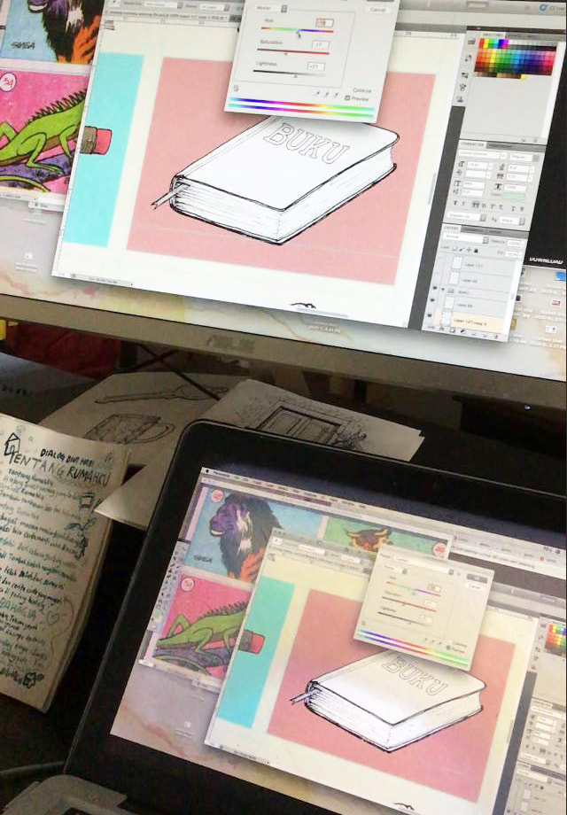 Adding colour with photoshop - I think a peachy background colour suits buku better! What do you think? Anyway, here's sharing a brief idea of how each illustration is being translated to the working file of the poster. At this stage, I've also decided to use this free font called 'Sketch Block' across the entire poster for the vocabulary instead of hand writing each text.
Here we go! The final piece for the gambar umbul project - My home! 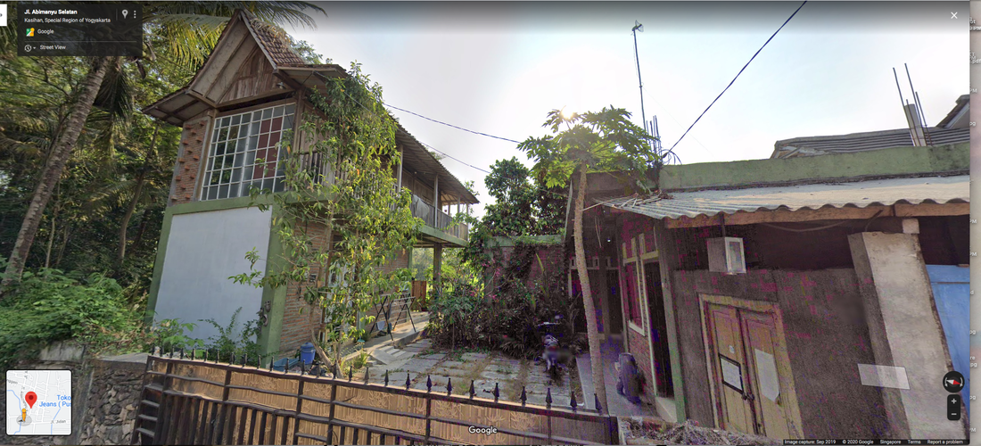 As I am currently in Singapore, I have only managed to do a google maps of the rented house that I live in when I am based in Yogyakarta for the sketch reference. But that'll do. Got it scanned after inking . 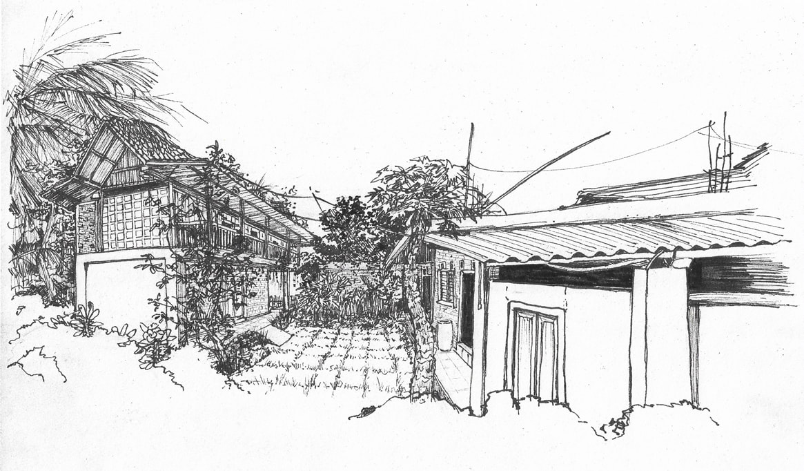 I'm very pleased with the result!
I will now start to work on the formatting before adding a dash of colours. Stay tuned! Here's a closeup of how I use a 0.05 technical pen to work on the detailing of intricate portions of certain illustrations to bring out texture such as the woven basket of this bicycle. It all starts with an initial sketch before inking with a technical pen. After yesterday's tests and drafting, I've decided to stick with technical pen to bring out the retro illustrated results. Graphic design with the assistance of a tablet to trace images is just not my thing - the soul of the artist does not translate too well with digitally produced graphics for the initial stages. I am also not apt with design skills in order to 'draw' with a tablet as well as I can with my control of the technical pen. Manual, slow, but suits me and the work.
Working on different dry mediums today before I decide if I should manually colour in the illustration for the project. Tried out the technical pen over the initial pencil sketch. Made more pencil tracing on other pages to try out inking with a brush and chinese ink. Then added some loose colour tests with markers. With the dateline coming soon, I think I will have to use photoshop to overlay the colours.
Okay! Will do just that! I've managed to collate my reference pictures for drawing. Putting them into a layout and I can't decide to create a horizontal or vertical presentation for the poster. I'll definitely have to fit 32 items including an artist's introduction/greeting in the layout. Finding some troubles with decision making as I still cannot visualise the outcome at the moment.
Oh well... hmm.... |
Archives
November 2020
Categories
All
|
 RSS Feed
